Usability Testing focuses on observing users’ behavior and seeks evidence about how to improve your product.
Usability Testing typically follow this format:
Process of Usability Testing(4W1H)
Design tasks and scenarios (What)
Recruit your representative user (Who)
Choose a place (Where)
Execute your test (How)
Analysis of your test result (Which)
Design tasks and scenarios(What)
Your tasks should be specific and concrete enough to verify the purpose of your work and the order of them should fit users’ operating habits. Scenarios contextualize the task, and should be written to provide an extra information to complete this task.
For example, you could design such tasks when testing a cosmetic website.
Task :
What do you think about this website? Which part impress you? What can you do in this website?
Imagine you are attracted by this cosmetic product in homepage, what would you do to search this product in detail ?
Imagine you want to buy this product ,what would you do to order a cosmetic product?
2. Recruit your representative user
It depends on your time and cost. Recruit the real target user if your resource is acceptable. Invite your friends or coworkers if your time is limited or you just want to do a fast iteration.
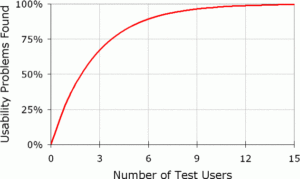
The suggested number of your representative users should be no more than 5 users. And you should run as many small tests as possible.
Why You Only Need to Test with 5 Users by nngroup
3. Choose a place
Where you run your test affects how you perform your work. The point is to let context drives the work. For example, if you want to test an productivity application, you might as well test it in an office-like environment.
4 . Execute your test
Recording tools: Choose a tool to catch as much data(User face, touch/click points, eye-tracking etc..) as you could.
Introduction(3 min): Designers should tell your user who we are, what sort of feedback we’re looking to receive and the purpose of this test is we’re testing the product not you before starting.
Background : Ask your user about her/his job description and how usually would your user use this similar product.
Task (20 min):
User feedback (3 min):
Remind :
Don’t give any help if they encounter some difficulties, just ask them what would they do if they encounter it.
Don’t lead participants.
5. Analysis of your test result(Which)
Take a quick note of some issues that was not recorded by tools before you forgot the details.
The severity of a usability problem is a combination of many factors including:
Frequency : How often does an issue occur ?
Business priority : Is this issue important to our marketing goal?
User feeling:Is this issue easy for users to overcome?
Use these metrics to allocate the most resources to fix the most important problems.
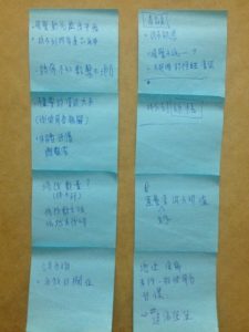
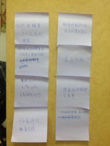
User issue arrangement using sticky notes in SKIN FARMER’s case.
Each colour of sticky notes represents one user.
We mapped the users’ feedback into x,y-plane in SKIN FARMER’s case. The x-axis represents its importance to user. The y-axis represents its importance to marketing impact.
Final:
Usability testing is an easy-to-perform technique to redefine your UX. You could run this test even in earlier stage using low-fi sketch like paper prototype. It helps us reshape what the product would be at cheap cost.